R for reproducible scientific analysis
Creating publication quality graphics
Learning Objectives
- To be able to use ggplot2 to generate publication quality graphics
- To understand the basics of the grammar of graphics:
- The aesthetics layer
- The geometry layer
- Adding statistics
- Transforming scales
- Coloring or paneling by groups.
Plotting our data is one of the best ways to quickly explore it and the various relationships between variables.
There are three main plotting systems in R, the base plotting system, the lattice package, and the ggplot2 package.
Today we’ll be learning about the ggplot2 package, because it is the most effective for creating publication quality graphics.
ggplot2 is built on the grammar of graphics, the idea that any plot can be expressed from the same set of components: a data set, a coordinate system, and a set of geoms–the visual representation of data points.
The key to understanding ggplot2 is thinking about a figure in layers: just like you might do in an image editing program like Photoshop, Illustrator, or Inkscape.
Let’s start off with an example:
library(ggplot2)
ggplot(data = gapminder, aes(x = lifeExp, y = gdpPercap)) +
  geom_point()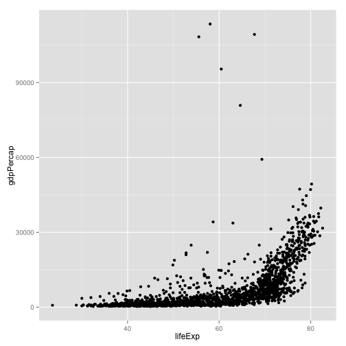
So the first thing we do is call the ggplot function. This function lets R know that we’re creating a new plot, and any of the arguments we give the ggplot function are the global options for the plot: they apply to all layers on the plot.
We’ve passed in two arguments to ggplot. First, we tell ggplot what data we want to show on our figure, in this example the gapminder data we read in earlier. For the second argument we passed in the aes function, which tells ggplot how variables in the data map to aesthetic properties of the figure, in this case the x and y locations. Here we told ggplot we want to plot the “lifeExp” column of the gapminder data frame on the x-axis, and the “gdpPercap” column on the y-axis. Notice that we didn’t need to explicitly pass aes these columns (e.g. x = gapminder[, "lifeExp"]), this is because ggplot is smart enough to know to look in the data for that column!
By itself, the call to ggplot isn’t enough to draw a figure:
ggplot(data = gapminder, aes(x = lifeExp, y = gdpPercap))Error: No layers in plot
We need to tell ggplot how we want to visually represent the data, which we do by adding a new geom layer. In our example, we used geom_point, which tells ggplot we want to visually represent the relationship between x and y as a scatterplot of points:
ggplot(data = gapminder, aes(x = lifeExp, y = gdpPercap)) +
  geom_point()
Challenge 1
Modify the example so that the figure visualise how life expectancy has changed over time:
ggplot(data = gapminder, aes(x = lifeExp, y = gdpPercap)) + geom_point()Hint: the gapminder dataset has a column called “year”, which should appear on the x-axis.
Challenge 2
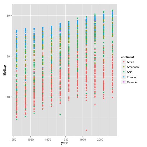
In the previous examples and challenge we’ve used the aes function to tell the scatterplot geom about the x and y locations of each point. Another aesthetic property we can modify is the point color. Modify the code from the previous challenge to color the points by the “continent” column. What trends do you see in the data? Are they what you expected?
Sometimes you will want to save plots. The function pdf creates a new pdf device. You can control the size and resolution using the arguments to this function. You then create your plot, which goes to the pdf device. Finally, you have to make sure to turn off the pdf device.
pdf("Life_Exp_vs_time.pdf", width=12, height=4)
ggplot(data=gapminder, aes(x=year, y=lifeExp, colour=country)) +
  geom_line()
dev.off()
Layers
Using a scatterplot probably isn’t the best for visualising change over time. Instead, let’s tell ggplot to visualise the data as a line plot:
ggplot(data = gapminder, aes(x=year, y=lifeExp, by=country, color=continent)) +
  geom_line()
Instead of adding a geom_point layer, we’ve added a geom_line layer. We’ve added the by aesthetic, which tells ggplot to draw a line for each country.
But what if we want to visualise both lines and points on the plot? We can simply add another layer to the plot:
ggplot(data = gapminder, aes(x=year, y=lifeExp, by=country, color=continent)) +
  geom_line() + geom_point()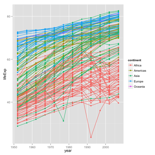
It’s important to note that each layer is drawn on top of the previous layer. In this example, the points have been drawn on top of the lines. Here’s a demonstration:
ggplot(data = gapminder, aes(x=year, y=lifeExp, by=country)) +
  geom_line(aes(color=continent)) + geom_point()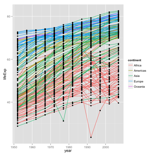
In this example, the aesthetic mapping of color has been moved from the global plot options in ggplot to the geom_line layer so it no longer applies to the points. Now we can clearly see that the points are drawn on top of the lines.
Transformations and statistics
Ggplot also makes it easy to overlay statistical models over the data. To demonstrate we’ll go back to our first example:
ggplot(data = gapminder, aes(x = lifeExp, y = gdpPercap, color=continent)) +
  geom_point()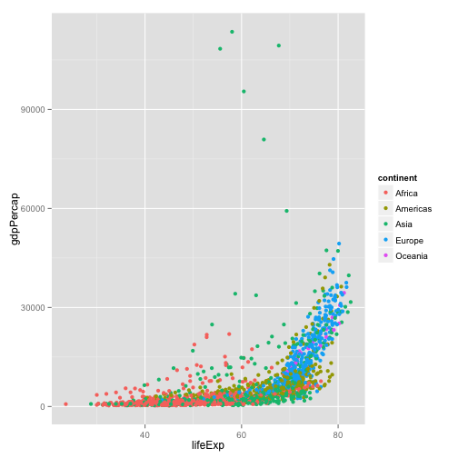
Currently it’s hard to see the relationship between the points due to some strong outliers in GDP per capita. We can change the scale of units on the y axis using the scale functions. These control the mapping between the data values and visual values of an aesthetic.
ggplot(data = gapminder, aes(x = lifeExp, y = gdpPercap)) +
  geom_point() + scale_y_log10()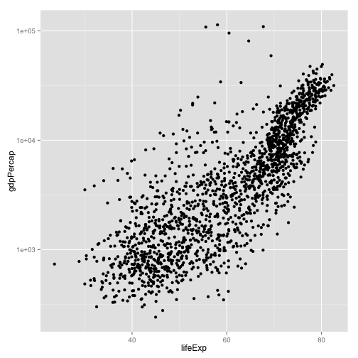
The log10 function applied a transformation to the values of the gdpPercap column before rendering them on the plot, so that each multiple of 10 now only corresponds to an increase in 1 on the transformed scale, e.g. a GDP per capita of 1,000 is now 3 on the y axis, a value of 10,000 corresponds to 4 on the y axis and so on. This makes it easier to visualise the spread of data on the y-axis.
We can fit a simple relationship to the data by adding another layer, geom_smooth:
ggplot(data = gapminder, aes(x = lifeExp, y = gdpPercap)) +
  geom_point() + scale_y_log10() + geom_smooth(method="lm")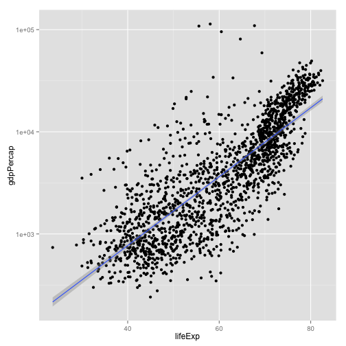
Challenge 3
Create a function that outputs two pdf files, each containing a plot of the data. Call the function from the main part of your script.
Challenge solutions
Solution to challenge 1
Modify the example so that the figure visualise how life expectancy has changed over time:
ggplot(data = gapminder, aes(x = year, y = lifeExp)) + geom_point()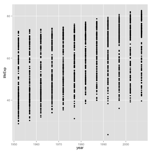
Solution to challenge 2
In the previous examples and challenge we’ve used the aes function to tell the scatterplot geom about the x and y locations of each point. Another aesthetic property we can modify is the point color. Modify the code from the previous challenge to color the points by the “continent” column. What trends do you see in the data? Are they what you expected?
ggplot(data = gapminder, aes(x = year, y = lifeExp, color=continent)) +
  geom_point()